Advanced graphing features in generativepy
Categories: generativepy
generativepy is an open-source Python drawing library for creating computer images, diagrams, and animations. It can be found on github. This article covers generativepy V50.00, although much of it will also apply to older or newer versions.
The graph module was introduced in the graphs in generativepy tutorial. In this tutorial, we will cover some more advanced techniques:
- Converting graph coordinates into drawing coordinates
- Drawing and labelling points on a graph
- Drawing lines and tangents
- Showing discontinuities of a function
- Filling graphs
- Highlighting sections of a graph
Converting graph coordinates into drawing coordinates
This graph shows the sine function. It also has a blue dot and a text label "Max" at a specific point on the curve:
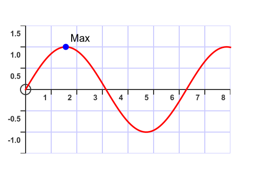
The point marks the graph's maximum value. The graph represents the sine function. We know that the sine function has a maximum value of 1 when x is pi/2. So we would like to draw a point at (pi/2, 1). But how do we do that?
The point is simply a circle filled with blue. We know how to draw a circle, but we set its position using pixel coordinates. But the point (pi/2, 1) is expressed in terms of the graph coordinates. Which pixel is at the centre of the circle? Well, the Axes object used to draw the graph has a useful function that converts graph coordinates into pixel positions:
    p = (math.pi/2, f(math.pi/2))
    pixel_p = axes.transform_from_graph(p)
Next, we'll see how to draw the point and label it.
Drawing and labelling points on a graph
The graph is similar to the example given in the graph article. Here is the full code that draws the graph and also adds the blue point and text:
import math
from generativepy.color import Color
from generativepy.drawing import setup, make_image
from generativepy.geometry import Circle, Text
from generativepy.graph import Axes, Plot


def draw(ctx, width, height, fn, frame_count):
    setup(ctx, width, height, background=Color(1))

    f = lambda x: math.sin(x)

    axes = (Axes(ctx, (50, 50), 400, 250).of_start((0, -1.5))
                                         .of_extent((8,3))
                                         .with_divisions((1, 0.5)))
    axes.draw()
    Plot(axes).of_function(f).stroke(Color(1, 0, 0), 3)

    # Add point and text label
    p = (math.pi/2, f(math.pi/2))
    pixel_p = axes.transform_from_graph(p)
    Circle(ctx).of_center_radius(pixel_p, 6).fill(Color("blue"))
    (Text(ctx).of("Max", pixel_p).offset(10, -10).font("Ariel")
             .size(20).fill(Color("black")))


make_image("plot-graph-point.png", draw, 500, 350)
The additional code first creates point p at (pi/2, 1), then calculates its position in pixel coordinates, pixel_p. This code was shown in the previous section.
We draw the blue point like this:
Circle(ctx).of_center_radius(pixel_p, 6).fill(Color("blue"))
This is a circle centered at pixel_pand colored blue. We give the circle a radius of 6, which seems to be a sensible size for the diagram. Notice that the radius is also measured in pixel coordinates rather than graph coordinates. So the circle has a radius of 6 pixels.
We draw the text label like this:
    Text(ctx).of("Max", pixel_p).offset(10, -10).font("Ariel")
             .size(20).fill(Color("black"))
We use the Text object in the usual way. Again, we use the pixel position pixel_p to position the text. We use an offset of 10 pixels to the right and 10 pixels up to move the text slightly away from the point, and we set the text size to 20 pixels. You can choose your own values, but they look about right.
Drawing lines and tangents
We sometimes need to draw additional lines on a graph. Here are a couple of examples:
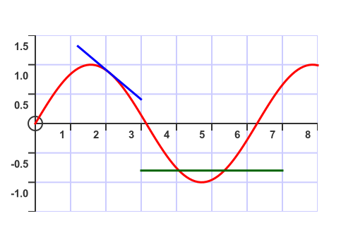
The green line is a simple horizontal line. The blue line is a tangent to the curve, which requires slightly more work, but it isn't too complicated. Here is the full code:
import math
from generativepy.color import Color
from generativepy.drawing import setup, make_image
from generativepy.geometry import Line
from generativepy.graph import Axes, Plot
from generativepy.math import Vector as V

def draw(ctx, width, height, fn, frame_count):
    setup(ctx, width, height, background=Color(1))

    f = lambda x: math.sin(x)
    fd = lambda x: math.cos(x)

    axes = (Axes(ctx, (50, 50), 400, 250).of_start((0, -1.5))
                                         .of_extent((8,3))
                                         .with_divisions((1, 0.5)))
    axes.draw()
    Plot(axes).of_function(f).stroke(Color(1, 0, 0), 3)

    # Add horizontal line
    p1 = (3, -0.8)
    p2 = (7, -0.8)
    pixel_p1 = axes.transform_from_graph(p1)
    pixel_p2 = axes.transform_from_graph(p2)
    (Line(ctx).of_start_end(pixel_p1, pixel_p2)
              .stroke(Color("darkgreen"), 3))

    # Draw tangent
    x = 2.1
    p = V(x, f(x))
    slope = fd(x)
    angle = math.atan(slope)
    delta = V.polar(1, angle)
    pixel_p1 = axes.transform_from_graph(p + delta)
    pixel_p2 = axes.transform_from_graph(p - delta)
    (Line(ctx).of_start_end(pixel_p1, pixel_p2)
              .stroke(Color("blue"), 3))

make_image("plot-graph-line.png", draw, 500, 350)
Drawing the green, horizontal line is quite easy. The line joins the two points (3, -0.8) and (7, -0.8), expressed in graph coordinates. We convert those two points to pixel coordinates and draw a line between them. Here is the section of the above code that draws the line:
    # Add horizontal line
    p1 = (3, -0.8)
    p2 = (7, -0.8)
    pixel_p1 = axes.transform_from_graph(p1)
    pixel_p2 = axes.transform_from_graph(p2)
    (Line(ctx).of_start_end(pixel_p1, pixel_p2)
              .stroke(Color("darkgreen"), 3))
The blue line is a tangent to the curve at x = 2.1. To create this, we first need to find the slope of the curve. It is helpful to know the derivative of the curve. Since the function f is sin(x), we know from high school maths that the derivative fd is cos(x). We define the function fd at the start of the draw function. Here is the part of the code that finds the tangent:
    x = 2.1
    p = V(x, f(x))
    slope = fd(x)
Point p is the point where the tangent touches the curve. Notice that we have defined the point p as a Vector, aliased as V. This lets us use vector operations to find the tangent line's endpoints.
Next, we find the two end points of the tangent line:
    angle = math.atan(slope)
    delta = V.polar(1, angle)
angle is the angle that the tangent line makes with the x-axis. We calculate it by taking the inverse tangent of the slope (the atan function).
delta is a vector, of length 1, that points in the direction of the tangent line. We do this by defining a vector in polar form, with a modulus of 1 and an argument of angle.
The vector p + delta gives a point that is on that tangent line, distance 1 from p. And p - delta gives a point that is on that tangent line, distance 1 from p in the opposite direction. If we convert those two points to pixel coordinates, then draw a line between them, we will draw a tangent line of length 2:
    pixel_p1 = axes.transform_from_graph(p + delta)
    pixel_p2 = axes.transform_from_graph(p - delta)
    (Line(ctx).of_start_end(pixel_p1, pixel_p2)
              .stroke(Color("blue"), 3))
Showing discontinuities of a function
If a function has a discontinuity, it often needs slightly special handling. For example, consider this function:
lambda f(x): 0 if x <= 3 else 1
This function has a value of 0 when x is less than or equal to 3, and 1 otherwise. There is a step change at x = 0, where the function goes from 0 to 1, without ever taking a value between 0 and 1.
However, if we plot this function in the usual way, we get something like this:
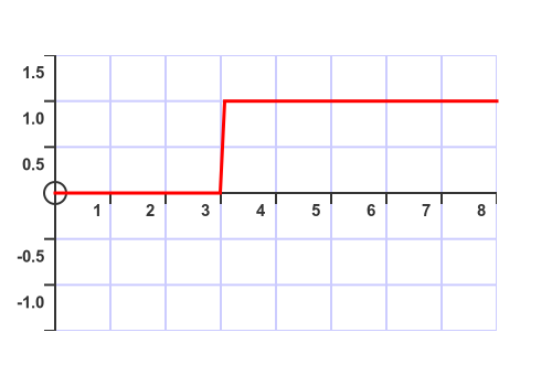
The problem here is that the Plot object calculates the value of the function at lots of different points, and then joins all those points together. So at x = 3 it doesn't show a discontinuity. Instead, it shows a step function, which isn't usually what we want.
What we really want is something like this:
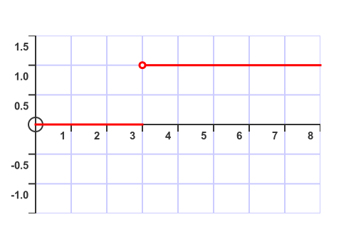
In this graph, the two sections are disconnected to indicate that the function changes from 0 to 1 without taking any intermediate values. We have also drawn an open circle at point (3, 1). This indicates that the value of the function is 0 when x is 3. The function equals 1 for any value of x greater than 3, so the top line gets infinitesimally close to (3, 1) but never reaches it.
Here is the code to draw the correct graph:
from generativepy.color import Color
from generativepy.drawing import setup, make_image
from generativepy.geometry import Circle, Text
from generativepy.graph import Axes, Plot

def draw(ctx, width, height, fn, frame_count):
    setup(ctx, width, height, background=Color(1))

    f = lambda x: 0 if x <= 3 else 1

    axes = (Axes(ctx, (50, 50), 400, 250).of_start((0, -1.5))
                                         .of_extent((8,3))
                                         .with_divisions((1, 0.5)))
    axes.draw()

    (Plot(axes).of_function(f, extent=(0, 2.9999))
               .stroke(Color(1, 0, 0), 3))
    (Plot(axes).of_function(f, extent=(3.0001, 8))
               .stroke(Color(1, 0, 0), 3))

    p = (3, 1)
    pixel_p = axes.transform_from_graph(p)
    (Circle(ctx).of_center_radius(pixel_p, 4).fill(Color("white"))
                                            .stroke(Color(1, 0, 0), 3))

make_image("plot-graph-discont.png", draw, 500, 350)
As you can see, we plot the function twice. The first plot is limited to the range 0 to 2.9999, using the extent parameter, so it plots the portion of the graph where the function is 0. The range starts at 0 because that is the start of the x-axis, and it extends to 2.9999 because that value is so close to 3 that it looks like the graph reaches 3, but the function does not change to 1.
The second plot is limited to the range 3.0001 to 8, so it plots the portion of the graph where the function is 1. The range starts at a value slightly above 3, but by so small an amount that it isn't visible on the graph. It extends to 8, which is the end of the x-axis.
Notice that we don't need to convert these values to pixel coordinates, because we are passing them into Plot.of_function, which already uses graph coordinates.
The open circle is created using a Circle object, in the same way that we previously marked a point in the graph. We need to convert the point (3, 1) to pixel coordinates, as before. To create the empty circle, we stroke it with the same color we used for the plot (red) and fill it with the same color as the graph background (white).
Highlighting sections of a graph
It is sometimes useful to highlight a section of a graph, like this:
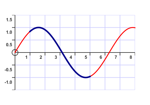
This is quite easy to do. We first plot the graph normally (the red curve), then plot the highlighted region (x from 1 to 5) using a thicker blue line. Here is the plotting code:
    a = 1
    b = 5
    Plot(axes).of_function(f).stroke(Color(1, 0, 0), 3)
    Plot(axes).of_function(f, extent=(a, b)).stroke(Color("darkblue"), 5)
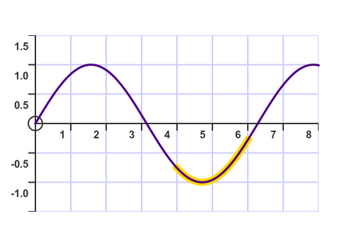
A slight variation on this is to plot the thicker highlight region first, then plot the main curve on top. This often works best with a lighter highlight color and a dark main color:
Filling graphs
We fill a graph by closing it, to make a closed shape. We do that with the close parameter of the of_function call. Here is the complete code:
import math
from generativepy.color import Color
from generativepy.drawing import setup, make_image
from generativepy.graph import Axes, Plot

def draw(ctx, width, height, fn, frame_count):
    setup(ctx, width, height, background=Color(1))

    f = lambda x: math.sin(x)

    axes = (Axes(ctx, (50, 50), 400, 250).of_start((0, -1.5))
                                         .of_extent((8,3))
                                         .with_divisions((1, 0.5)))
    axes.draw()

    a = 1
    b = 2.5
    (Plot(axes).of_function(f, extent=(a, b), close=((b, 0), (a, 0)))
               .fill(Color("red").with_a(0.5))
               .stroke(Color(1, 0, 0), 3))

make_image("plot-fill.png", draw, 500, 350)
In this code, we plot a graph of f between x values of a and b. But we also add two extra points, using the close parameter:
- The point (b, 0) is on the x-axis directly below the end of the curve segment.
- The point (a, 0) is on the x-axis directly below the start of the curve segment.
These are shown here:
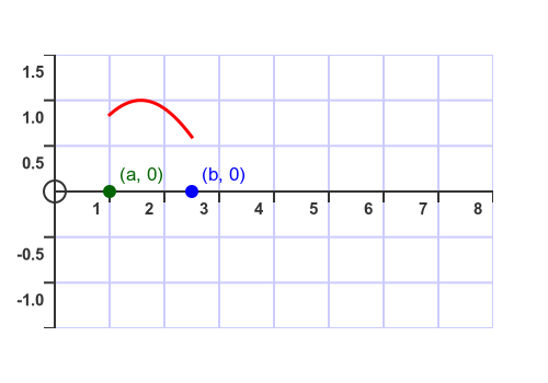
When we use the close parameter, the Plot object adds some extra lines to create a closed shape:
- It adds a line from the endpoint of the graph to the first point in the close list, which is (b, 0) in our case.
- It adds a line from the first point of the close list to the second point in the close list, which is (a, 0) in our case.
- If the close list had more elements, they would also be joined, but in our case there are only the elements.
- Finally, it adds a line from the last point in the close list, which is (a, 0) in our case, back to the start of the curve.
This creates a closed shape which we can outline and fill. Here is the final result of the original code above:
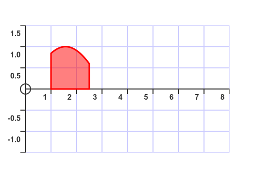
One thing to notice is that we have used a transparent fill color Color("red").with_a(0.5). This is red but 50% transparent. That is optional, of course, but it can look nice because the graph grid lines show through the fill.
There are a couple of useful variants. You might prefer to fill the curve without any additional outlines, like this:
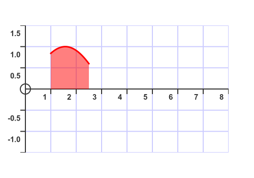
We do this by plotting the graph twice. The first time, we close the graph and fill it, but we don't stroke it. The second time, we plot the graph without closing it, and this time we stroke the graph without filling it (i.e., we plot the graph normally). Here is the plotting code:
    (Plot(axes).of_function(f, extent=(a, b), close=((b, 0), (a, 0)))
               .fill(Color("red").with_a(0.5)))
    (Plot(axes).of_function(f, extent=(a, b))
               .stroke(Color(1, 0, 0), 3))
You might also want to plot the graph across the full axis width, like this:
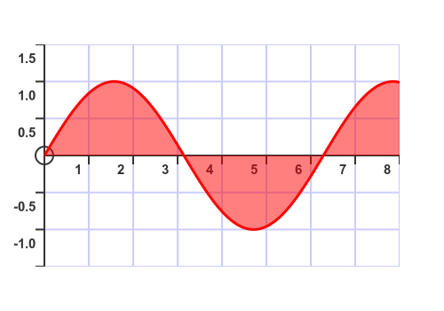
To do this, set a and b to the start and end of the axes (0 and 8 in this case).
Related articles
Join the GraphicMaths Newsletter
Want article discussions, announcements, and discounts on GraphicMaths books and products? Join the newsletter:
Popular tags
adder adjacency matrix alu and gate angle answers area argand diagram binary maths cantor cardioid cartesian equation chain rule chord circle cofactor combinations complex modulus complex numbers complex polygon complex power complex root cosh cosine cosine rule countable cpu cube decagon demorgans law derivative determinant diagonal differential equation directrix dodecagon e eigenvalue eigenvector einstein ellipse equilateral triangle erf function euclid euler eulers formula eulers identity exercises exponent exponential exterior angle first principles flip-flop focus gabriels horn galileo gamma function gaussian distribution gradient graph hendecagon heptagon heron hexagon hilbert horizontal hyperbola hyperbolic function hyperbolic functions infinity integration integration by parts integration by substitution interior angle inverse function inverse hyperbolic function inverse matrix irrational irrational number irregular polygon isomorphic graph isosceles trapezium isosceles triangle kite koch curve l system lhopitals rule limit line integral locus logarithm maclaurin series major axis matrix matrix algebra mean minor axis n choose r nand gate net newton raphson method nonagon nor gate normal normal distribution not gate octagon or gate parabola parallelogram parametric equation pentagon perimeter permutation matrix permutations pi pi function polar coordinates polynomial power probability probability distribution product rule proof pythagoras proof pythagorean triple quadrilateral questions quotient rule radians radius rectangle regular polygon rhombus root sech segment set set-reset flip-flop simpsons rule sine sine rule sinh slope sloping lines solving equations solving triangles special relativity speed of light square square root squeeze theorem standard curves standard deviation star polygon statistics straight line graphs surface of revolution symmetry tangent tanh transformation transformations translation trapezium triangle turtle graphics uncountable variance veridical paradox vertical volume volume of revolution xnor gate xor gate